<script>
import { quintOut } from 'svelte/easing';
import { fade, draw, fly } from 'svelte/transition';
import { expand } from './custom-transitions.js';
import { inner, outer } from './shape.js';
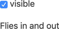
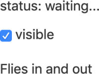
let visible = true;
</script>
{#if visible}
<svg xmlns="http://www.w3.org/2000/svg" viewBox="0 0 103 124">
<g out:fade="{{duration: 200}}" opacity=0.2>
<path
in:expand="{{duration: 400, delay: 1000, easing: quintOut}}"
style="stroke: #ff3e00; fill: #ff3e00; stroke-width: 50;"
d={outer}
/>
<path
in:draw="{{duration: 1000}}"
style="stroke:#ff3e00; stroke-width: 1.5"
d={inner}
/>
</g>
</svg>
<div class="centered" out:fly="{{y: -20, duration: 800}}">
{#each 'SVELTE' as char, i}
<span
in:fade="{{delay: 1000 + i * 150, duration: 800}}"
>{char}</span>
{/each}
</div>
{/if}
<label>
<input type="checkbox" bind:checked={visible}>
toggle me
</label>
<link href="https://fonts.googleapis.com/css?family=Overpass:100,400" rel="stylesheet">
<style>
svg {
width: 100%;
height: 100%;
}
path {
fill: white;
opacity: 1;
}
label {
position: absolute;
top: 1em;
left: 1em;
}
.centered {
font-size: 20vw;
position: absolute;
left: 50%;
top: 50%;
transform: translate(-50%,-50%);
font-family: 'Overpass';
letter-spacing: 0.12em;
color: #676778;
font-weight: 400;
}
.centered span {
will-change: filter;
}
</style>